Blackmagic Cinema Camera + Davinci Resolve Colour Grading Breakdown

BMCC + Davinci Resolve Colour Grading Breakdown from Juan Melara on Vimeo.
BMCuser.com member Kholi posted up some Blackmagic Cinema Camera raw DNGs the other day. So I thought I'd have another go at grading BMCC footage. Find the DNGs in this thread here.
The BMCC just impresses me more and more each time I work with the footage. I'm yet to shoot with it, but from a post production/grading point of view it's a pretty amazing camera. That said, I'm yet to grade badly shot footage!
The grades
For the first grade I wanted something that looked relatively neutral, whilst still looking more polished/graded than the source footage. I still think I might have pushed it too far. The second grade is my version of Kholi's "Eerie green" grade found in his vimeo video here. View the video above to see these grades in motion and to see a breakdown of the "Eerie green" grade.
Grading Skin
When grading I always try hard to keep the skin from looking plastic as is seen in a lot of digitally shot material. Especially feature films that have been pushed through film output emulation LUTs. You don't have to browse Blu-ray.com or Apple Trailers for too long to stumble upon a lot of these films.
To avoid plastic looking skin I do two things:
- 1. I make sure there is colour variation within the skin tone.
- 2. I respect the specular highlights.
1. To add (or keep) variation in the skin tone I qualify the skin, and then use the colour wheels to tint the skin. I usually add blue/purple in the shadows. The midtones usually get pushed in the opposite direction that the Midtone wheel pushed in my Mid/Low Tint node. The highs are usually pushed a fraction yellow and in the opposite direction as the Highlight wheel in my High Tint node. Usually I do the skin balancing after the main look for the grade has been set. But its always a push/pull back and forward balancing act to make sure everything in the grade gels.
Adding or retaining colour variation in the skin prevents the monotone plastic look that is all too common.
2. The other common thing I see is skin that has had the specular highlights graded out. This creates a flat lifeless look. Couple this with a monotone skin palette and your in a world of ugly.
A lot of the time making grading decisions that dont kill the specular highlights is all you need to do. But sometimes I find that creating a serial node off the main skin node that tints just the skin specular highlights is necessary.
I make sure that this node has the same exact qualification as the previous node. Then I set the High Range from between 0.500 - 0.666 and use the highlight colour wheel to tint the highs. Usually I add a bit of blue/purple and even teal. This plays off nicely with the yellow that was added to the highs in the main skin node. Sometimes I bump the brightness of the highlights a fraction to get them to pop more, but its not always necessary.
Skin Tone Examples
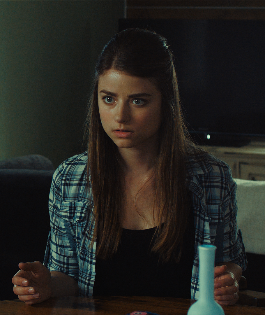
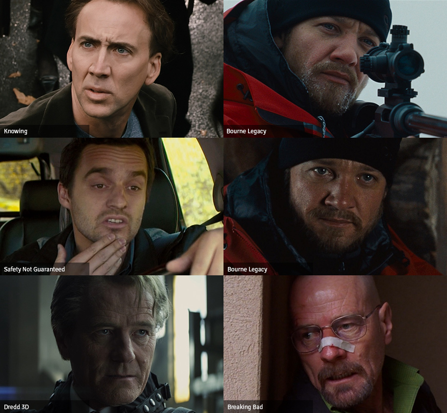
UPDATE: Someone on BMCuser wanted to see examples of plastic/bad skin tones and examples of good skin tones. Below are a few, it should be obvious which is which. All grabs were taken from the 1080p jpgs on Blu-ray.com except for the Hitchcock grab which was taken from the 1080p trailer on Apple Trailers.
These are not meant as direct comparisons, since there is different grading intentions, lighting etc.

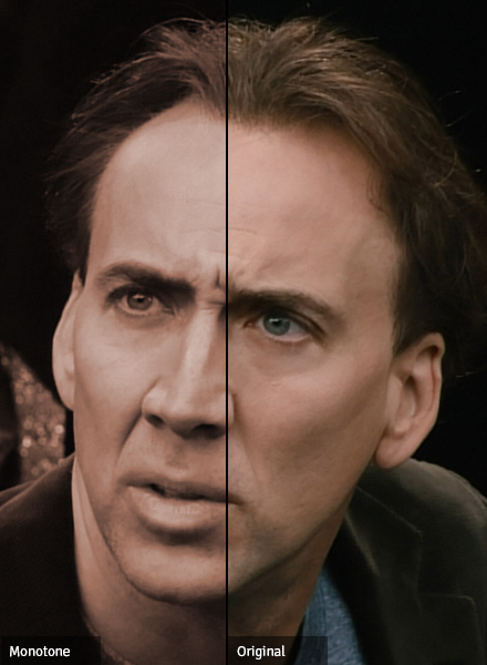
And just to show you how bad it can get, I took one of the worst examples of monotone skin I could find and made one side completely monotone. Not much difference!
I'll write up a proper post on grading skin with examples etc in the near future...
Click images for 1080p versions.